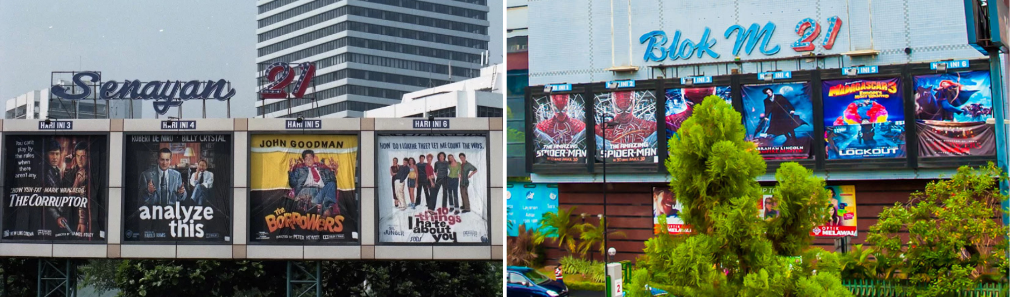
When I was in elementary school, in 2000s Jakarta, I had to drive by a mall to get to school. It had six billboards stuck to its exterior, featuring posters of the films showing in the cinema. They’re not prints of the posters, but hand-painted versions on large cloth panels. And for a seven-year-old, watching these works of art sway in the wind through bleary eyes at 6:30 am was a sweet little treat. Oh, how exciting it was to see a change in the billboards to announce a newcomer, to lay your eyes on a poster and get a glimpse into a new world, to decide in the 10 seconds your car drives by if it interests you.
There is duality to a film poster: the advertising side and the artistic side. Not to say that these don’t overlap—a poster is an extension of the art form—but its number one priority is to get people into seats. The first poster for a film program was a lithograph by advertising pioneer Jules Chéret for Projections Artistiques in the 1890s, which features a woman holding a card with the showtimes.
Unlike an advertisement, what makes a film poster good is far less clear-cut. Stylistically, it’s already a matter of subjectivity, but a film poster also has the burden of distilling the essence of a two-hour moving picture into one still sheet. Director and avid film poster collector Martin Scorsese said that a poster needs to be distinct from its movie, yet still an extension of it: “It had to give you some sense of the picture, but it also carried its own mystery and romance.” And what’s transpired since then is good art.
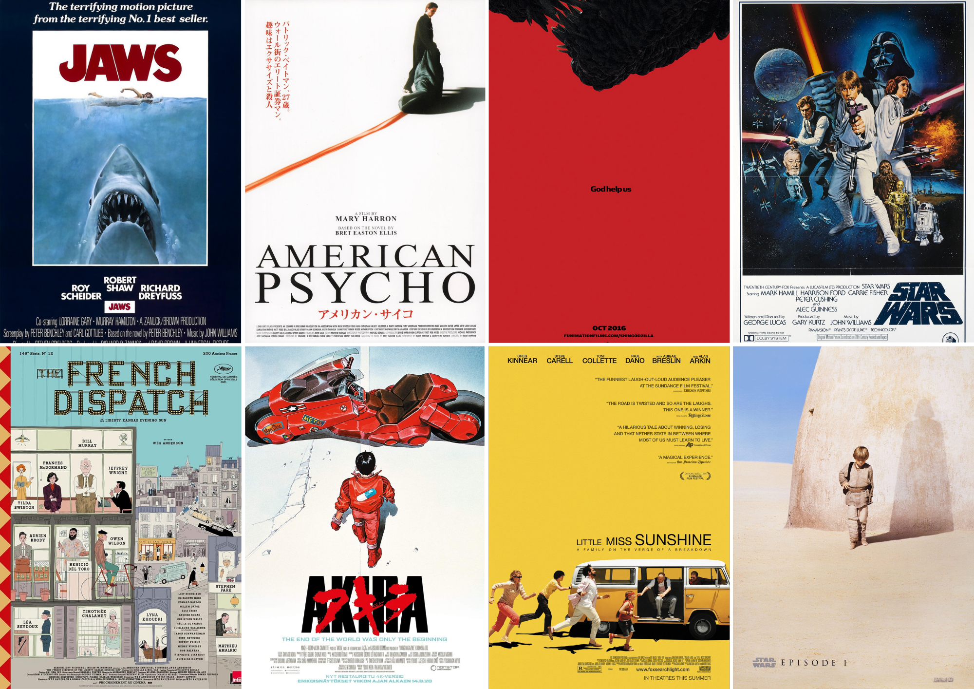
It’s uncontroversial to say that Jaws (1975) has one of the most iconic and enduring film posters. It’s a poster designed by Tony Seiniger, featuring artwork made by Roger Kastel for the novel on which the movie is based. This minimalist yet bold illustration captures the anxiety and premise of the movie succinctly. You wouldn’t need words to understand what this movie will be about, but you still have a chance to fill in the gaps with your own imagination as well. In a sea of posters, you’d still be able to pick this one out even without the title.
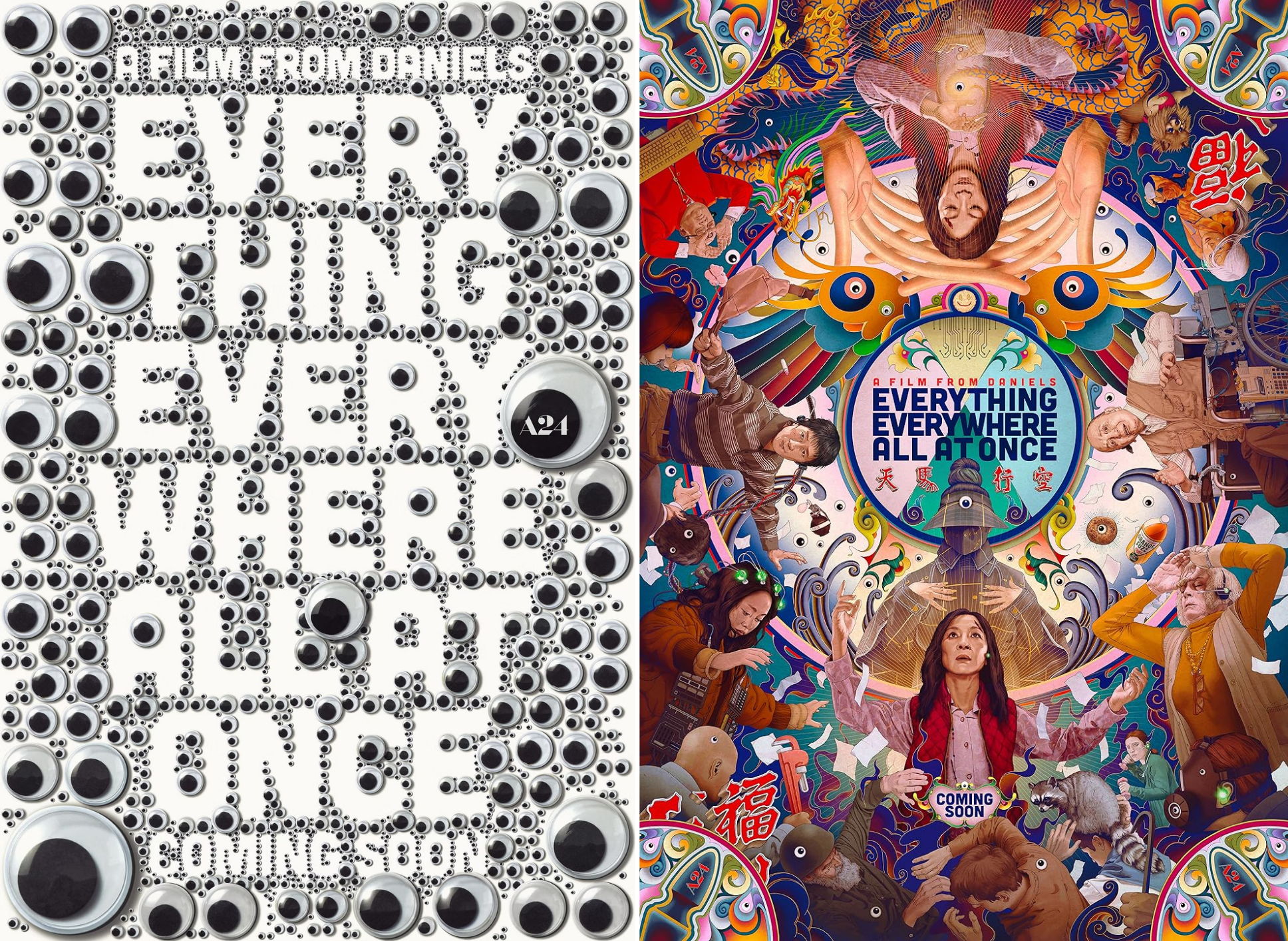
But it’s not as simple as saying that a minimalist, bold poster works best. On the opposite end of the spectrum is Everything Everywhere All At Once (2022). Both the teaser and (one of the) official film posters are maximalist and psychedelic, pulling you into a world that promises exactly what the title says. After watching the movie, you understand why the posters encapsulate its chaos and absurdity perfectly without spoiling anything, while still standing on their own as works of art.
I asked some of my friends for their favorite film posters. Answers include: American Psycho (2000), Japanese show bill, Shin Godzilla (2016) teaser, Star Wars: Episode IV (1977), Star Wars: Episode I (1999) teaser, The French Dispatch (2021), Akira (1988), Little Miss Sunshine (2006).
While this group of friends seems to lean minimalist, these posters are very different from each other. Our subjectivity clearly comes into play when appraising them. “I love a good illustration,” Mayra said about French Dispatch’s New Yorker-inspired poster. “The original hand-painted posters are my all-time favorite!” Said Didi about this specific Episode IV poster.
The minimalism of the American Psycho, Shin Godzilla, Little Miss Sunshine, Akira, and Episode I posters also manifests differently in colors, typography, scale, and composition, each evoking a distinct type of mystery and romance.
Throughout the years, there have been auteurs who have set themselves apart organically. Vasilis Marmatakis is famed for his evocative work for Yorgos Lanthimos’s films. Marmatakis said that his poster designs are “his honest reactions to the films,” and he leans heavily into specific themes or storylines from the movies. He treats film posters as a gateway to a movie instead of a summary: “Not that my posters represent exactly the film, but metaphorically, they do.” While his posters are very specific to each movie, his auteurship shines through: a preference for negative space, unconventional compositions, and an intangible quality you can’t really pinpoint. He’s selling us mystery and, albeit subversively, romance.
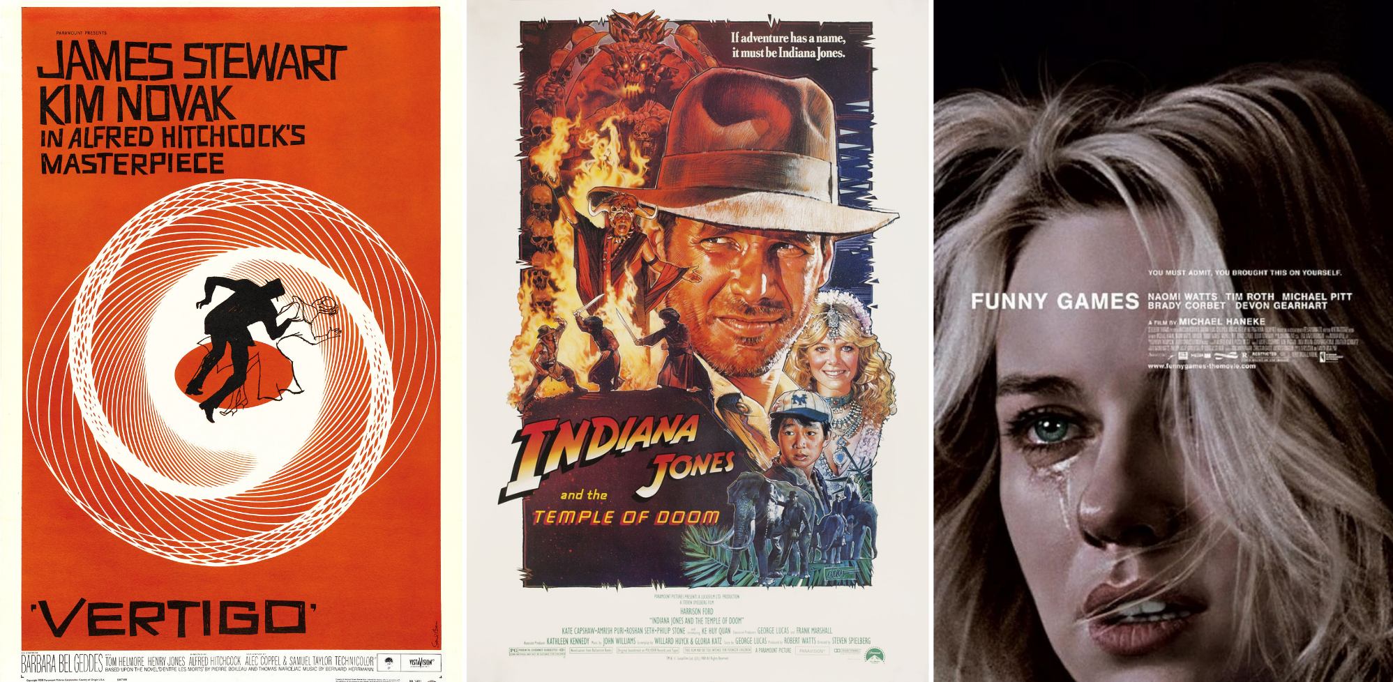
Of course, he’s not the only auteur who’s established their own distinct style: Saul Bass, e.g., Vertigo (1958), Anatomy of a Murder (1959), The Shining (1980), Drew Struzan (Indiana Jones series, Star Wars series, Back to the Future series), and Akiko Stehrenberger (Funny Games, 2008), I’m Thinking of Ending Things (2020), Beef (2023).
Film posters have become a special interest in their own right. People collect them, pay for Letterboxd’s Patron membership so that they can choose their own film posters, restore them (or watch professionals do it on TikTok), and create their own concept or fan art. Fan-made film posters are probably one of the highest-selling items on Redbubble; I’m sure all of us have seen at least one Polaroid-style film poster in our lifetime.
Polaroid-style film posters running rampant aside, there is a design trend in film posters that I and many others vehemently reject: the floating heads trend. Studios are now pouring in the most money they’ve ever had to get A-list movie stars. And I’m sure, on top of contractual obligations, studio execs want to leverage these actors’ star power as best they can to ensure a good return on investment. This strategy to put these actors’ fame to good use on a poster is not novel; the minimalist posters for Gilda (1948) and Sunset Boulevard (1950) relied heavily on Rita Hayworth and Gloria Swanson, respectively. It’s not a crime to highlight the movie’s cast on a poster—unless you make a bad one.
There is now an epidemic of superimposing the heads of every single cast member onto a vaguely relevant setting, or a few shades of a punchy color, and calling it a day. And I reckon it’s the Avengers’ fault. Highlighting movie stars on posters used to be the way to cut through the noise; now it is the noise. It doesn’t matter whose faces are on the poster; they all look the same. Maybe that’s why my friends tend to prefer the minimalist posters now, because we’re all so fatigued by movie posters overcrowded by bodiless heads.
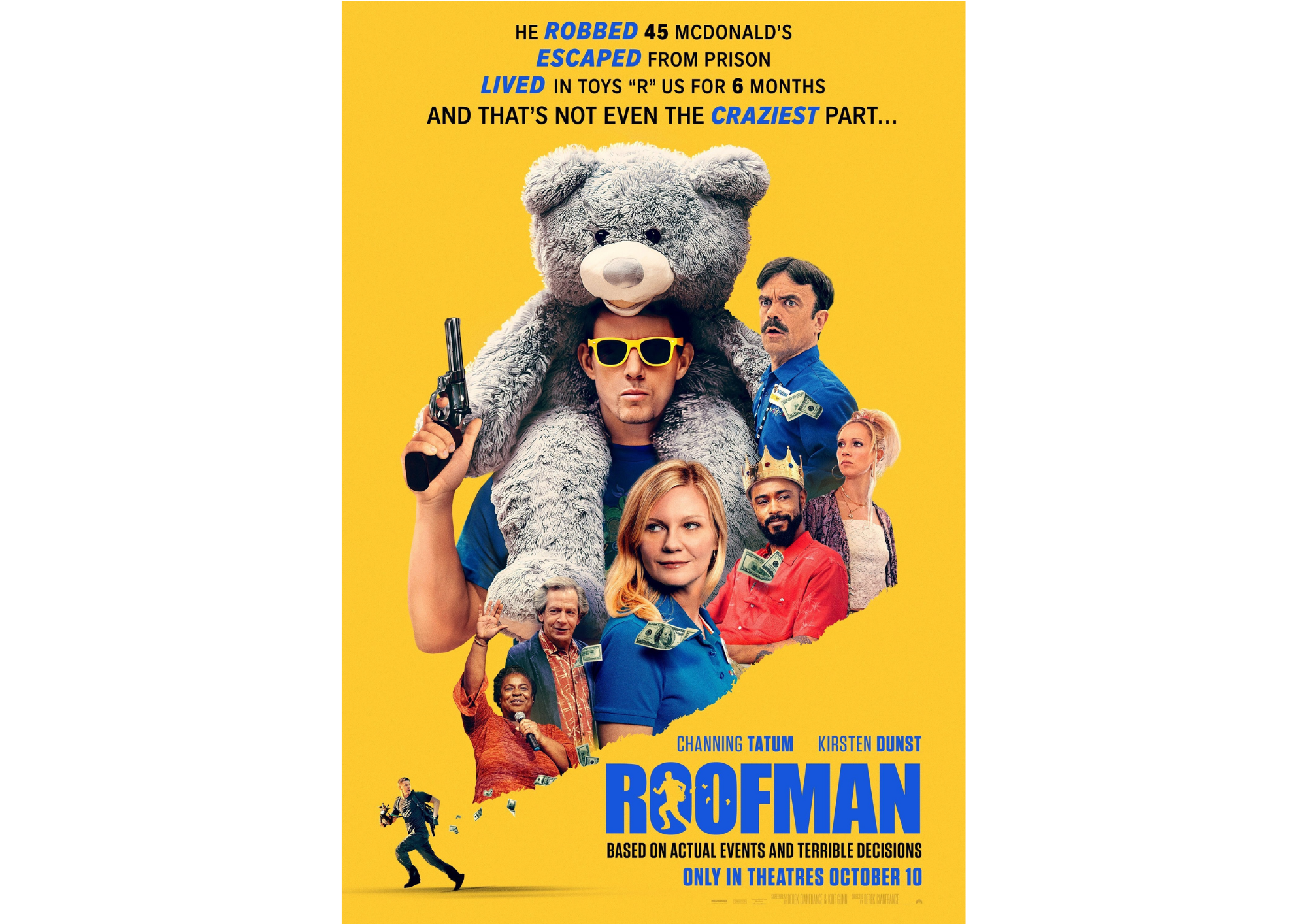
The worst-case scenario would be a film poster completely misunderstanding the movie, undermining the work of the team, and consequently misleading the viewers. I recently watched Roofman (2025). From the poster, I thought it’d be a lighthearted mid-tier action comedy about a guy hiding out in a Toys”R”Us. But two hours later, I was at a completely different place than where I thought I’d be; it’s actually a heartfelt dramedy that explores the protagonist’s criminality as well as morality and belonging.
There are filmmakers who fight to make sure that a poster adds to the overall moviegoing experience. There are execs who think movie posters are only a piece of advertisement. There are the collectors, the appreciators, and the passerbys. And there are the designers and creators. I think of those painters whose job was to recreate film posters to become something larger than life, whose job now has ceased to exist. Almost.
Parsan is a film poster painter who started his career in 1987 and has yet to stop. He works at Rajawali Cinema in Purwokerto, likely the last cinema that still uses hand-painted versions of film posters. Instead of large cloth panels, he works on a 2-by-1-meter (approx. 6.5 by 3 feet) plywood plank and paints his own iteration of the film poster. Howdy Indonesia dubbed him as “one of the last popular film poster painters in Indonesia.”
Every part of a movie is important, and the film poster is nothing short of a crucial and unique part of the craft.


